
ANORA
Font Design + Poster Design + Publication Design
ABOUT THE PROJECT
Anora is a contemporary readable blackletter derived from Rotunda and early script traditions. The project reconsiders blackletter not as ornamental or theatrical, but as structured, legible, and composed.
The goal was to retain the authority and depth of blackletter while refining its proportions and internal geometry for clarity in modern contexts. Anora positions blackletter as functional.
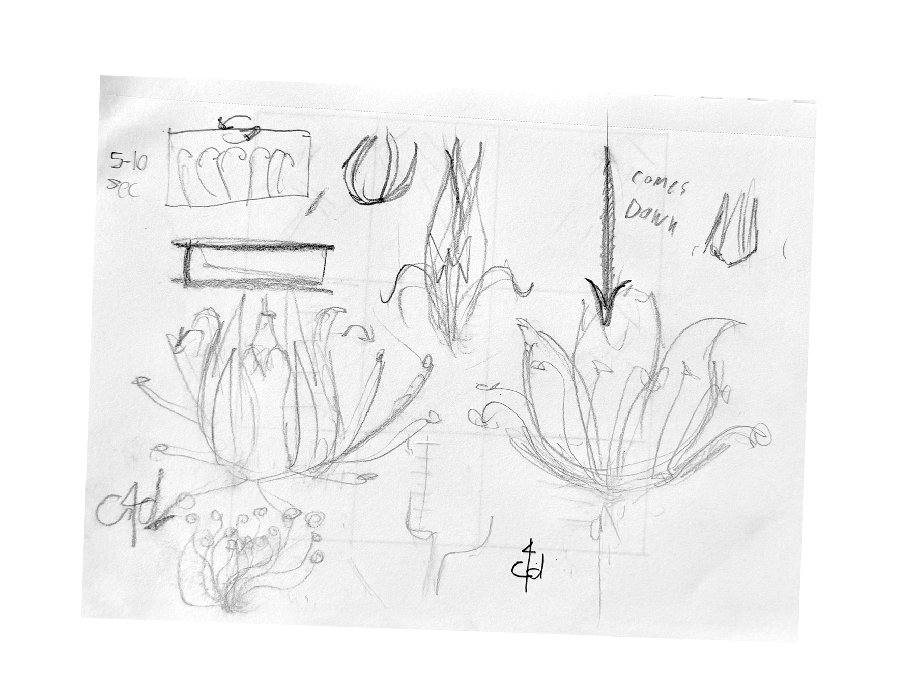
PROCESS
The process began with studying the history of blackletter and examining key references such as Fraktur Mon Amour and Blackletter: Type and National Identity. These sources helped build an understanding of the cultural context, structural principles, and evolution of the script.
From there, the focus shifted to analyzing the underlying construction of blackletter forms. Early development started with sketching to explore proportion, stroke logic, and rhythm before refining the system into a cohesive and readable typeface.
MOTION EXPLORATION
I produced an experimental video to study movement patterns inspired by micro-organisms. This exploration helped define principles of rhythm and interaction, serving as a reference point rather than a direct step toward the final animation.
PRODUCTION
The final animation builds on the conceptual research, using 3D form variation and motion to express the idea of separate entities evolving into a cohesive structure. Rather than replicating the exploration video, it focuses on interpreting the concept with clarity and spatial depth, framing diversity as a pathway to unity.