JUJU SODA
Packaging Design
ABOUT THE PROJECT
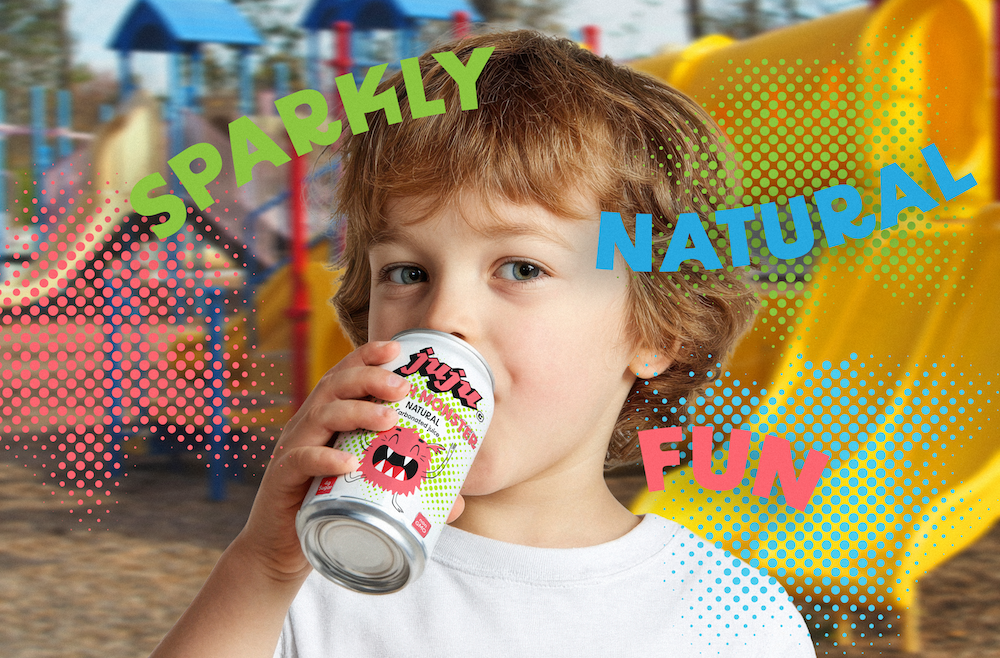
Juju began with a simple observation: kids often reach for regular soda, even though most of what’s on the shelf isn’t made with them in mind.
That insight became the starting point for a design exploration, how could a beverage for children feel fun and familiar while presenting a healthier alternative?
As a designer and strategist, I approached Juju as a study in visual language and perception. The goal wasn’t to imitate existing soda brands, but to rethink how form, color, and tone can communicate clarity, trust, and playfulness at the same time.
PROCESS
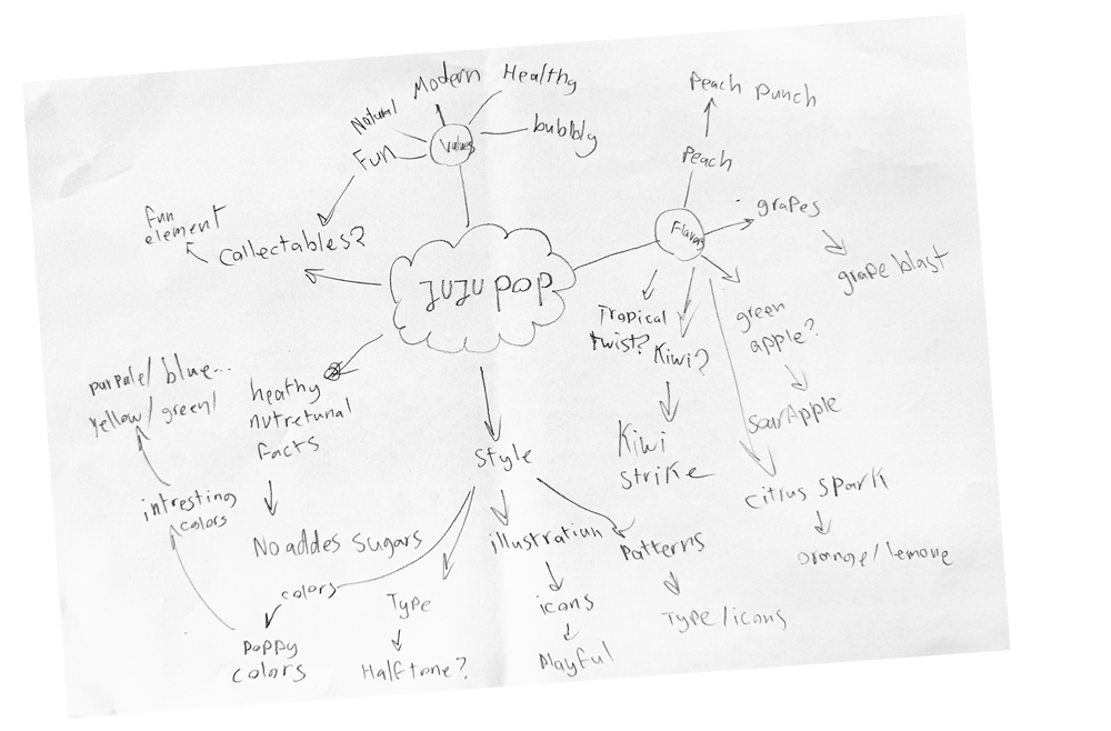
The development of Juju started with loose sketches and mind maps that explored tone, personality, and structure. Because the audience is children, with parents as the decision-makers, the challenge was to find a balance between playful energy and clear, trustworthy communication. These early explorations helped define that balance.
I tested shapes, rhythms, and expressions that felt light and approachable without drifting into overly cartoonish territory. The process was about understanding the system first, mapping the emotional space the brand needed to occupy, and letting the logo form grow naturally from those insights.
PRODUCTION
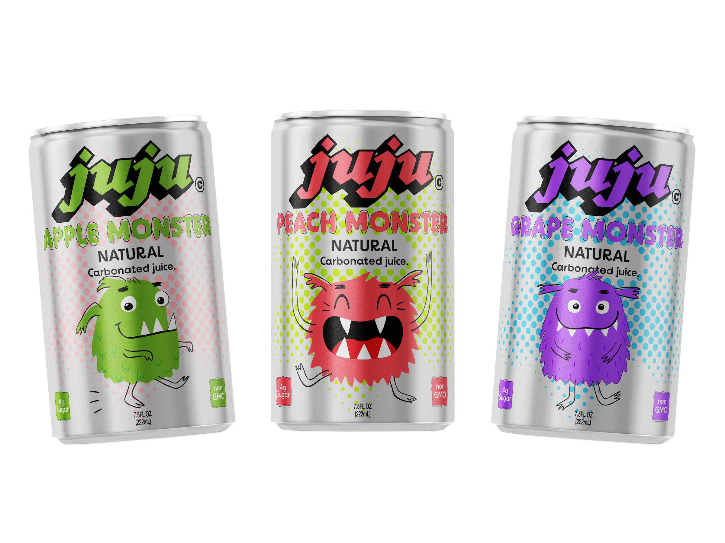
I chose the 7.5 oz mini-can format, because it’s the child-friendly size most beverage companies use. I kept the natural aluminum as the background instead of printing a full-bleed color. This works better for production, PMS spot colors print cleaner on metal, stay vibrant, and avoid registration issues that happen with heavy ink coverage.
The metallic background was also an audience choice. Kids want something fun, but they’re often drawn to the “grown-up” look of real soda cans. Keeping the silver finish gives that mature feel.
The final Juju cans bring the visual system together in a clear, compact format that reflects the project’s balance between playfulness and simplicity.
In the end, Juju became a study in how small, intentional design choices can shift how a product feels and who it speaks to, especially within everyday packaging.